I created this website using Squarespace.
For this project, my client allowed me to take charge of her website and use my own design choices. I made sure to know what pages she needed and the actions that she wanted her users to take.
My client needed a homepage that could showcase some of her work as a photographer, an about page that clearly expressed who she is as a person and what her business is all about, a page that showed her work, a pricing catalogue, and a contact section.
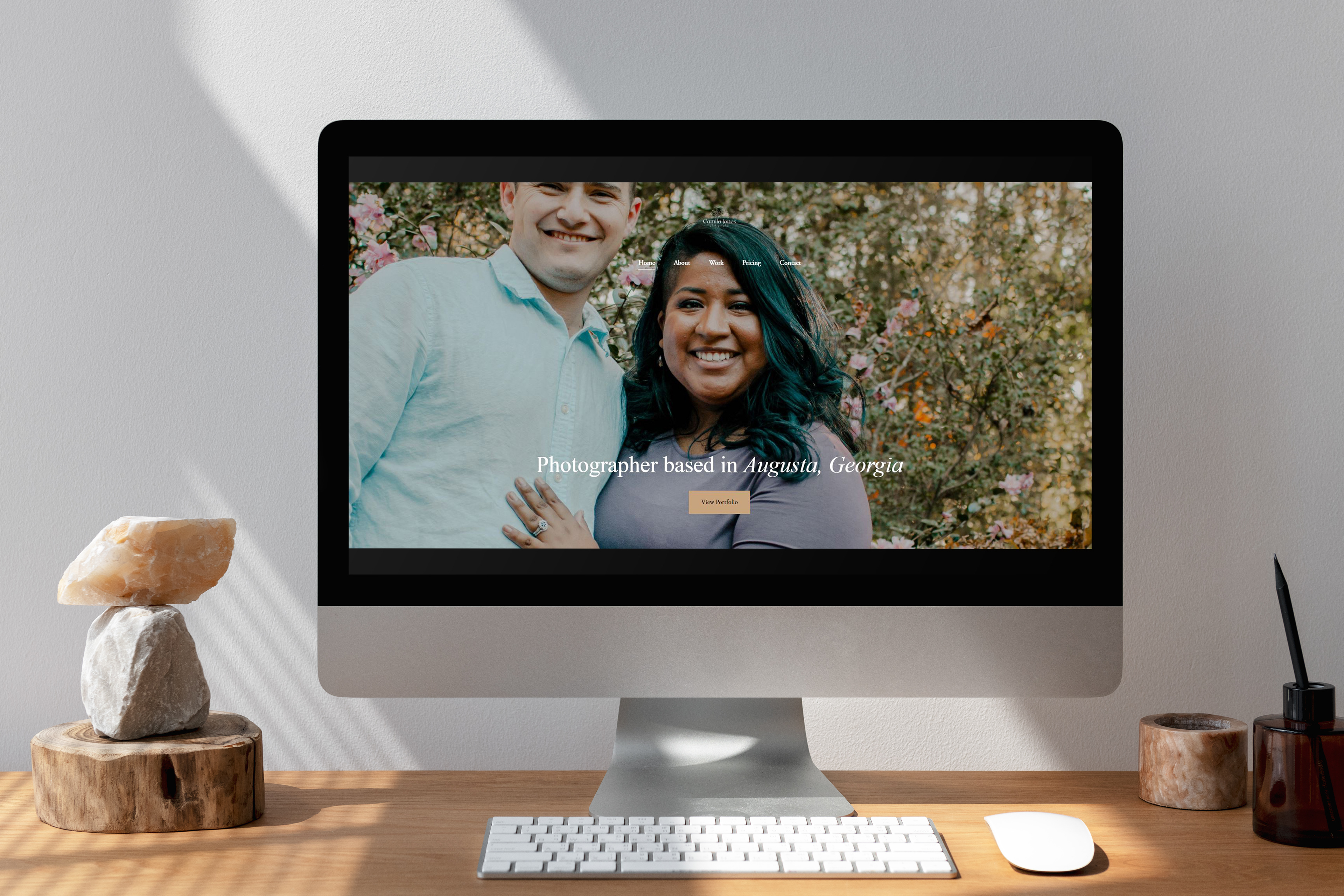
1. Homepage: For the homepage, I added a picture of the photographer that showed her style and personality. There is a button right away that takes you to her portfolio page. After that, there is a section for reviews, which is important because it is one of the first things people look for when they visit a site. After that, there is a picture taken by my client, along with a button that takes you to a site where you can schedule a session. The software we chose was Square Scheduling because it is a free platform that is easy to use and edit. Finally, I added a button to contact my client and a gallery that is clickable.


2. About: The about page has a picture of my client, information about her (most importantly, the cities that she works at), and animation in the background. Animations need to be used wisely. I decided to use it on this page because there is not a lot of text and this animation in particular is simple enough that it doesn't distract the user. Squarespace also has a cool feature that allows the user to stop the animation if it makes them uncomfortable.


3. Work: This page has a portfolio of the pictures that my client has taken. I divided them by session. Each session or post has a link to the next project at the end of the page.


4. Pricing: This page has three different packages. I used pictures that has similar backgrounds and lighting so that they all looked related. I used a card view for this section because it adds more contrast to the text against the color of the background. At the end of the page, there is a button that takes the user to book a session.

5. Contact: This page has a form where users can add their information, message, and what package they are interested in. I didn't make the "package" section required because my client is open to attending other events aside from the packages she has listed on her site, which is clearly stated on this page.
This project was fun because I was able to use my creativity and make this website user-friendly and aesthetically pleasing.
